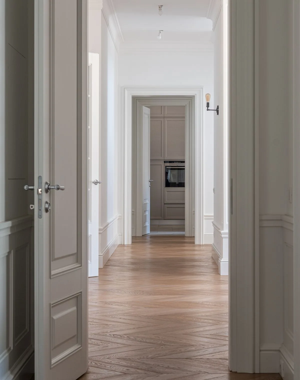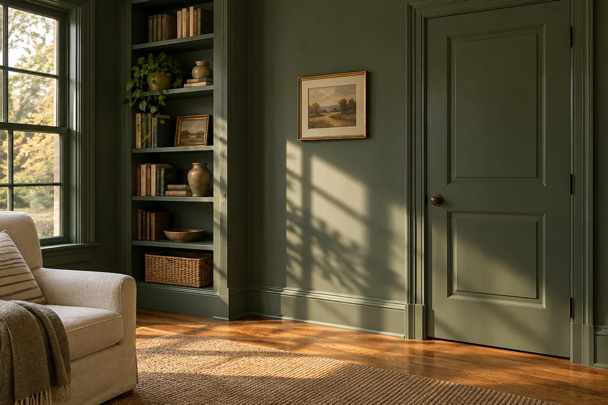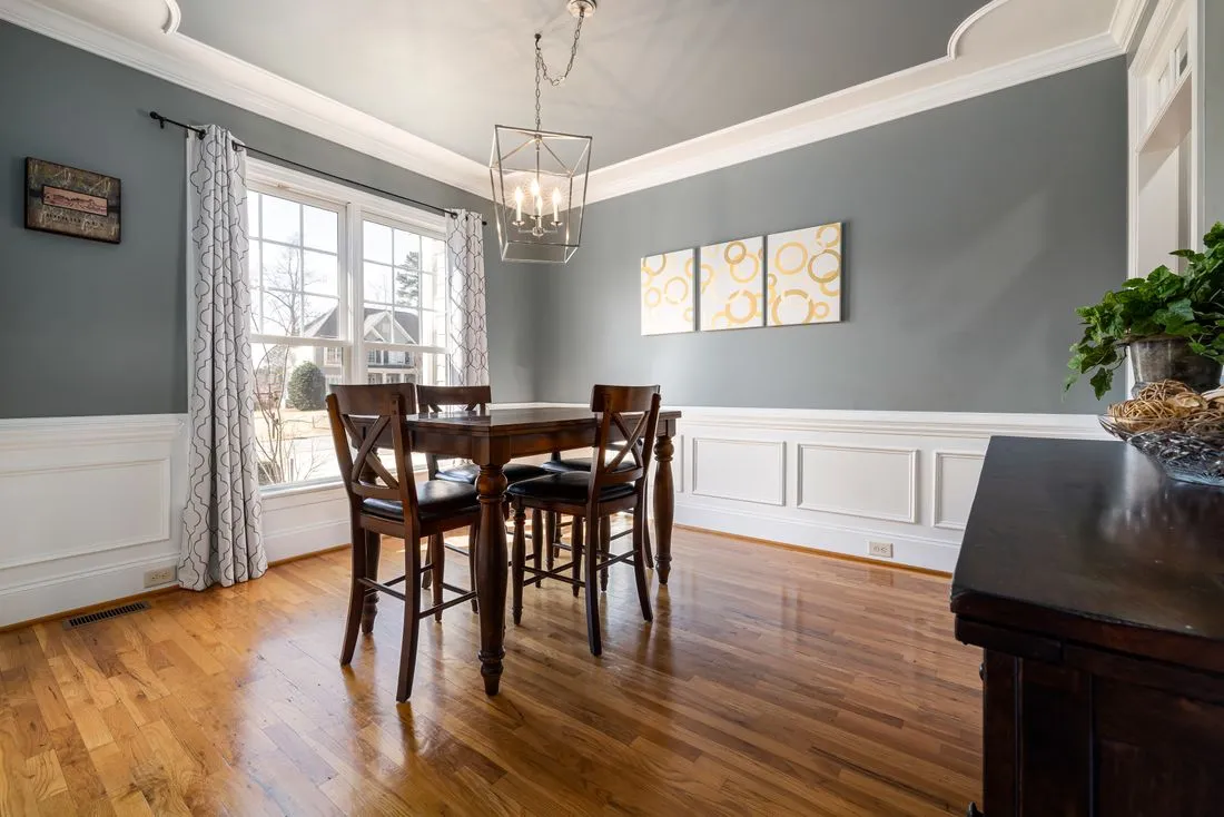
White trim can look pink beside a green-gray wall, creamy beside a bright window frame or blue in cool daylight. The paint has not necessarily changed. Its undertone, reflected light and the surrounding colors are influencing what you see.
Begin with the fixed surfaces. Flooring, stone, cabinets and existing window finishes may be harder to change than the wall paint. Compare proposed trim colors beside those materials in the actual room, not only against a sheet of plain white paper.
Use comparison carefully
A reference white can help reveal undertones, but it should not become the only standard. A very bright reference can make many suitable paints look dirty or yellow by contrast. The important comparison is with the surfaces the trim will meet every day.
Try a small number of different directions rather than a stack of almost identical shades. If one is clearly too creamy and another too icy, a middle option has a reason to be considered. If every sample seems wrong, examine the lighting and wall color instead of assuming the next white will solve everything.
Paint the actual profile when possible. Shadows in a cove and highlights on a bead can make the same paint appear to contain several tones. A flat card cannot reproduce that geometry.
Check the evening room
Light bulbs can change how the relationship reads. Evaluate the samples with the lamps you expect to use, and avoid judging under a temporary work light that will disappear after the project. If adjacent rooms are visible together, compare the doorway from both sides.
You do not have to make every white object match. A deliberate distinction between painted trim and a factory-finished window can be quieter than a near-match that looks accidental. The profile and sheen can help establish that the materials have different roles.
Do not use a photograph as the final color judge. Automatic camera adjustments and screen settings can remove or exaggerate the very undertone you are trying to assess.
Once a sample works across the relevant conditions, record the full product and sheen as well as the color name. Changing paint lines can change the visual result even when a nominal color formula is shared.
For example, a room with a fixed cream cabinet finish may make a very cool trim white look bluish. Moving toward a warmer sample might settle that relationship, but the same sample still needs checking beside an existing white window. If the two fixed finishes already differ, an exact match to both may be impossible. Choose which relationship matters most in the main view, or use a deliberate color contrast that stops pretending to be a match.
This is also a reason to view samples separately after comparing them together. Side-by-side contrast helps identify differences; viewing the selected sample alone shows whether those differences actually matter in the room.
The aim is a white that belongs beside the room's materials. “Neutral” is not a guarantee printed on a can; it is a relationship you confirm where the trim will live.