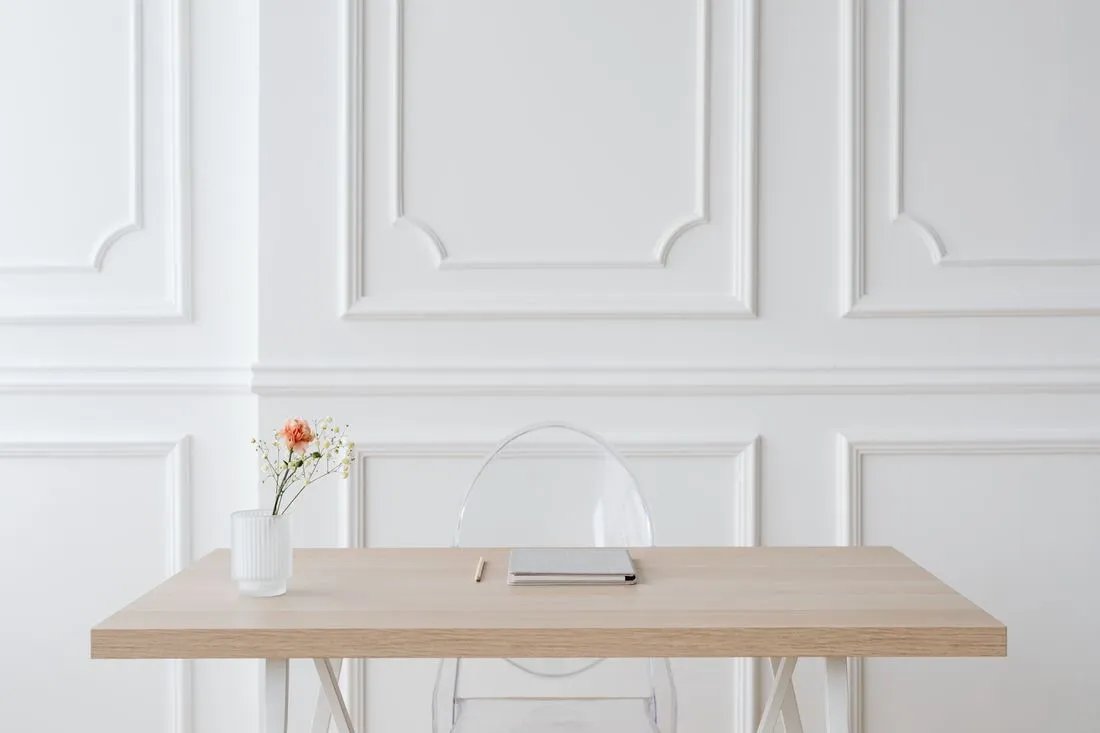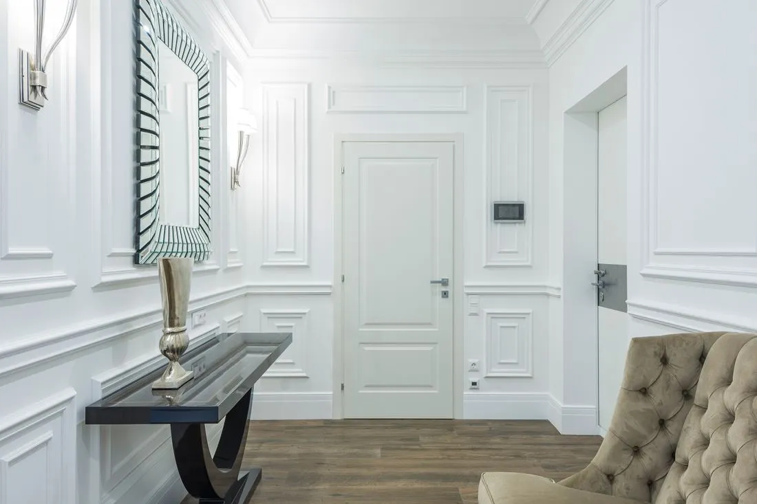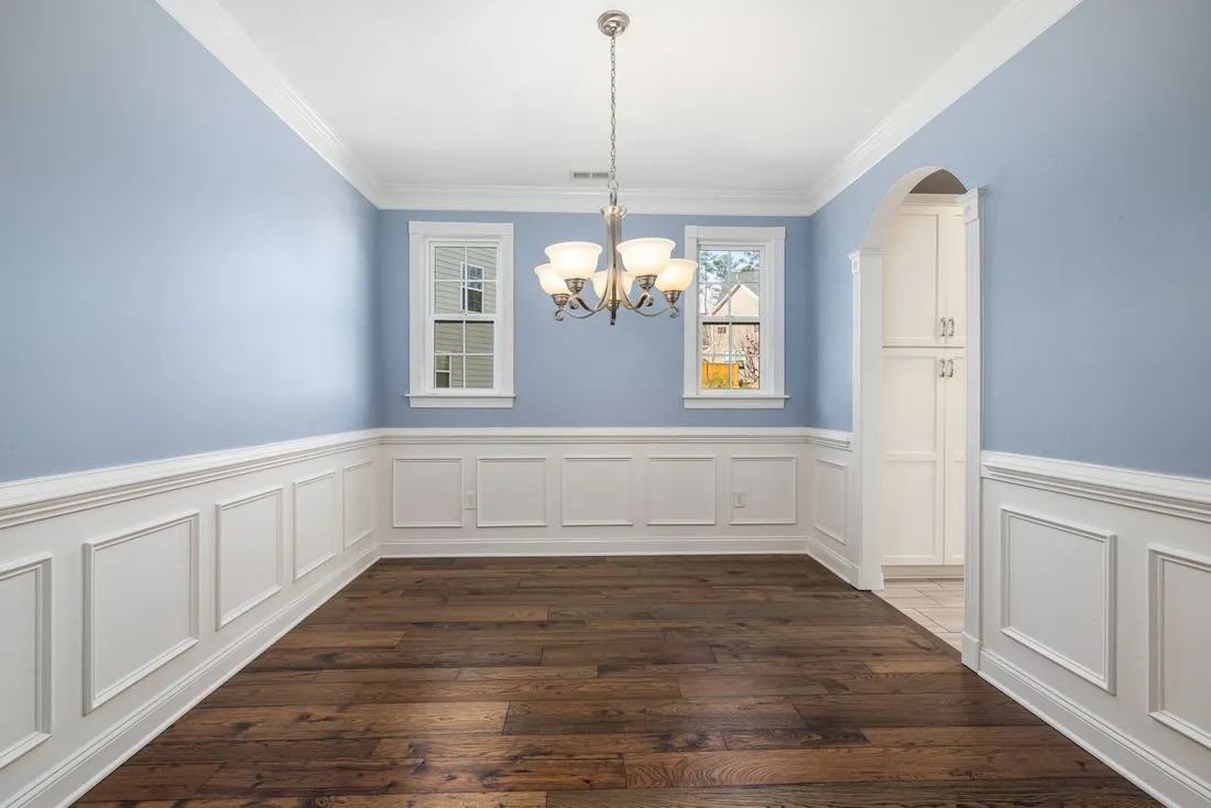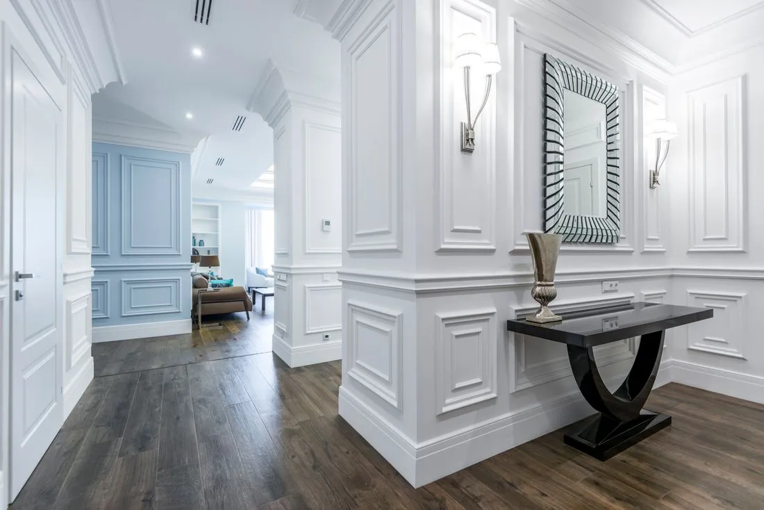
Two rows of wall-molding frames can give a tall wall more structure than one large rectangle. They can also create a busy grid if every line has equal emphasis. Decide which row should lead and what the band between them is meant to do before dividing the wall into boxes.
The two rows do not have to be equal in height. A shorter lower row and taller upper row often create a readable hierarchy. Equal rows produce a different, more regular pattern. The right relationship depends on the ceiling, furniture, windows, and the amount of plain wall you want to retain.
Account for all the horizontal bands
Measure the usable wall height between the top of the baseboard and the lower edge of any ceiling trim. Then reserve the bottom margin, top margin, and middle gap. If a chair rail sits between the rows, its full width belongs in the calculation as well.
For an illustrative layout, imagine 90 inches of usable height. Reserve 5 inches at the bottom, 7 at the top, and a 6-inch clear band between the rows. That leaves 72 inches for the two outside frame heights. A 26-inch lower frame and a 46-inch upper frame use that space exactly.
Those figures are a way to check the arithmetic, not a recommended layout. A sideboard could hide most of the lower frame, or a window could cut through the proposed middle band. The measured furniture and architecture must be added before the arrangement is approved.
If the middle zone contains a 3-inch rail plus gaps above and below it, write those as separate dimensions. Calling the whole area “6 inches” without identifying what it includes is an invitation to install the rows too close together.
Decide what aligns vertically
Matching the left and right edges of upper and lower frames creates a clear stacked structure. Different widths can work, but they need an obvious reason. Randomly offset rows tend to make the wall look as though two separate layouts were applied.
A wider central upper frame can emphasize a main axis, with lower frames responding to a sideboard or seating arrangement. Before choosing that option, check whether the furniture is likely to move. Permanent molding designed around one temporary cabinet can become difficult to furnish later.
Use tape that represents the profile width. With two rows, the molding occupies more wall than a thin-line drawing suggests. Stand back and compare the amount of decorated surface with the remaining plain wall.
Reduce competing detail
A deeply shaped profile, contrasting paint, wallpaper inserts, and a strong chair rail all increase the grid's presence. You may not need all of them. If the wall feels busy, simplify one of those elements before making every frame larger.
Look at the upper corners of the room as well. A narrow top margin beside a substantial cornice can make the upper row feel squeezed. The lower row may be generous while the top remains visually crowded.
Check the design from seated positions. The middle band may sit directly behind heads or at the top of furniture, changing the impression from the standing view. Artwork and lamps should be included in that evaluation.
Number the rows and frames on the final elevation. State which measurements are outside dimensions and which are clear gaps. Two-row layouts contain enough similar pieces that a precise drawing saves confusion.
If a single row looks better after the comparison, keep the single row. The second row earns its place by improving the wall's proportions, not by making the project appear more elaborate.